2022 Custard 6X7
品牌創研 BRAND 視覺設計 VISUAL DESIGN 平面攝影 PHOTOGRAPHY 動態廣告 FILM 社群行銷 SOCIAL MEDIA
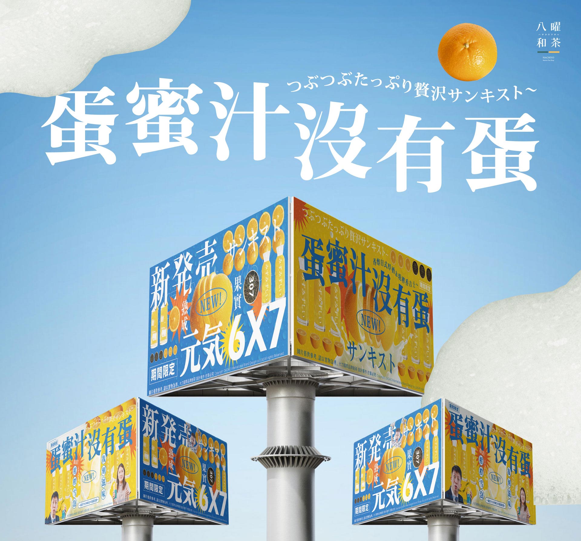
清新藍黃奏響視覺交響曲,香吉士風味元氣登場!
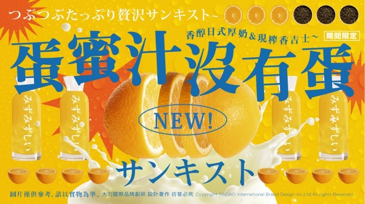
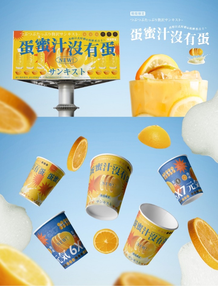
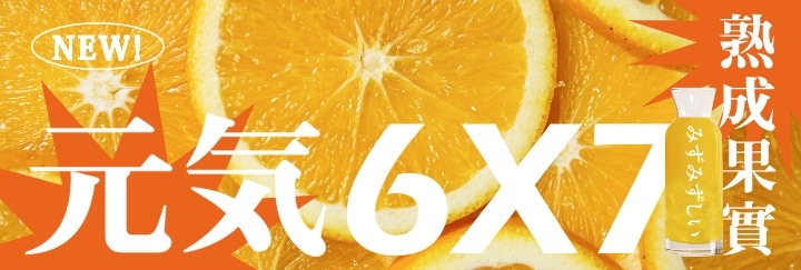
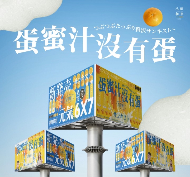
清爽的藍色與元氣滿滿的黃色構成了「蛋蜜汁沒有蛋」系列的主視覺基調,營造出既活力四射又清新的品牌形象。藍色主要運用於6X7的視覺設計上,凸顯產品清爽、解渴的特質,給人一種輕盈自在的感受;而黃色則集中於蛋蜜汁的主題設計,象徵陽光般的明亮與朝氣,使整體畫面更具吸引力與感染力。兩種色彩搭配香吉士元素,打造出具有強烈視覺辨識度的畫面主題,將產品的核心特性直觀地傳達給消費者。
The refreshing blue and vibrant yellow form the visual foundation of the “Egg Honey Juice Without Egg” series, creating a brand image that is both dynamic and fresh. Blue is primarily applied to the 6X7 visual design, highlighting the product’s refreshing and thirst-quenching qualities, evoking a sense of lightness and ease. Meanwhile, yellow is concentrated in the theme design of Egg Honey Juice, symbolizing the brightness and energy of sunlight, making the overall visual more appealing and lively. The combination of these two colors with orange elements creates a visually distinctive theme that effectively conveys the core characteristics of the product to consumers.

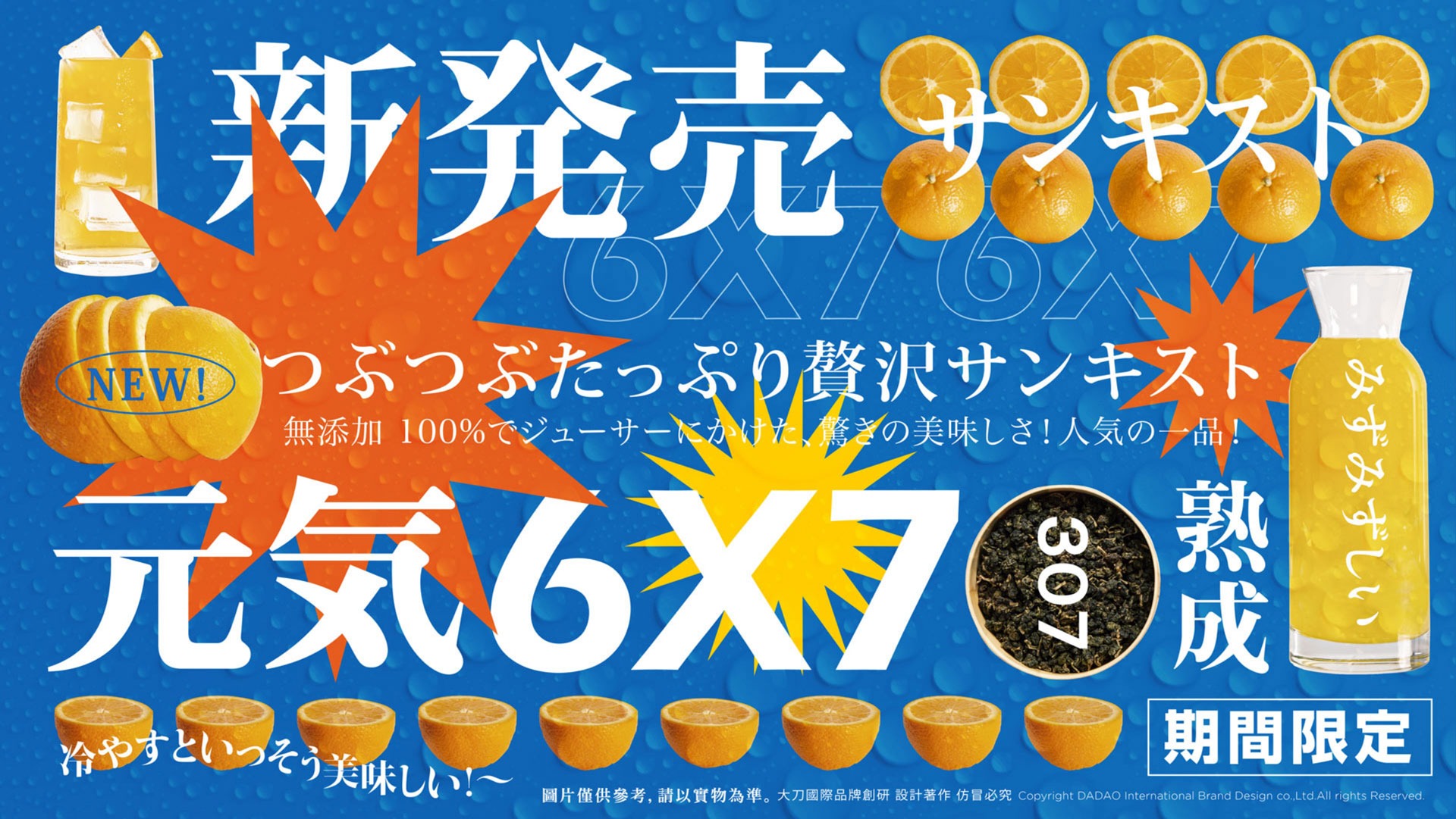
直白而有趣,視覺語言塑造品牌深刻印象
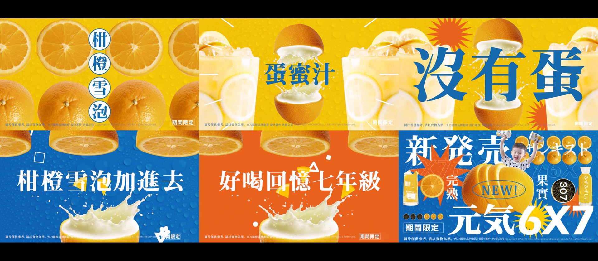
設計上巧妙地結合了相關素材與俏皮文字,讓整體呈現更生動有趣,增強廣告的互動性與記憶點。無論是「蛋蜜汁沒有蛋」的標題設計,還是6X7的產品標示,都直白而有力地向觀眾傳達了產品的賣點。這樣的設計語言不僅符合年輕消費群體的審美偏好,更成功地在視覺與情感上與觀眾建立聯繫,進一步提升品牌的整體影響力。
The design cleverly integrates relevant elements and playful text, making the overall presentation more lively and engaging, enhancing the advertisement’s interactivity and memorability. Whether it’s the title design of “Egg Honey Juice Without Egg” or the product labeling of 6X7, both effectively and directly communicate the product’s selling points to the audience. This design language not only aligns with the aesthetic preferences of younger consumers but also successfully establishes a connection with the audience on both visual and emotional levels, further enhancing the brand’s overall impact.


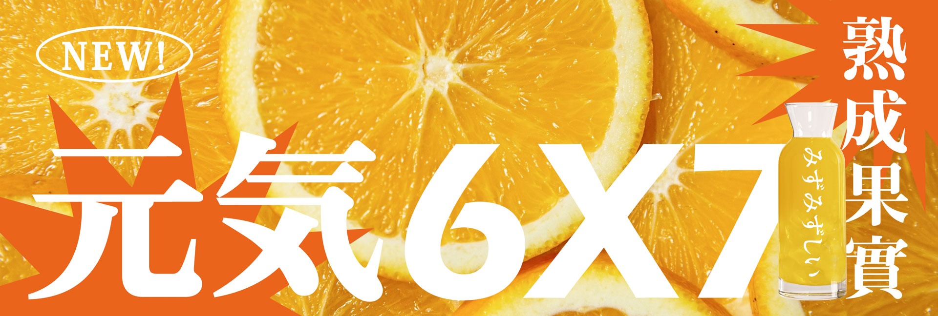
清新藍黃奏響視覺交響曲,香吉士風味元氣登場!
清爽的藍色與元氣滿滿的黃色構成了「蛋蜜汁沒有蛋」系列的主視覺基調,營造出既活力四射又清新的品牌形象。藍色主要運用於6X7的視覺設計上,凸顯產品清爽、解渴的特質,給人一種輕盈自在的感受;而黃色則集中於蛋蜜汁的主題設計,象徵陽光般的明亮與朝氣,使整體畫面更具吸引力與感染力。兩種色彩搭配香吉士元素,打造出具有強烈視覺辨識度的畫面主題,將產品的核心特性直觀地傳達給消費者。
The refreshing blue and vibrant yellow form the visual foundation of the “Egg Honey Juice Without Egg” series, creating a brand image that is both dynamic and fresh. Blue is primarily applied to the 6X7 visual design, highlighting the product’s refreshing and thirst-quenching qualities, evoking a sense of lightness and ease. Meanwhile, yellow is concentrated in the theme design of Egg Honey Juice, symbolizing the brightness and energy of sunlight, making the overall visual more appealing and lively. The combination of these two colors with orange elements creates a visually distinctive theme that effectively conveys the core characteristics of the product to consumers.
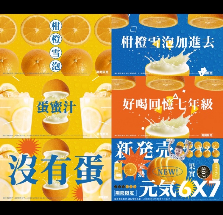
直白而有趣,視覺語言塑造品牌深刻印象
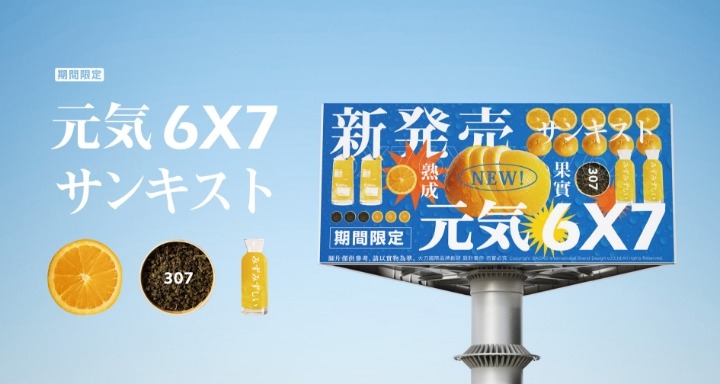
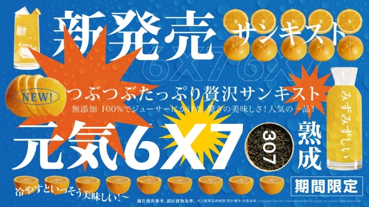
設計上巧妙地結合了相關素材與俏皮文字,讓整體呈現更生動有趣,增強廣告的互動性與記憶點。無論是「蛋蜜汁沒有蛋」的標題設計,還是6X7的產品標示,都直白而有力地向觀眾傳達了產品的賣點。這樣的設計語言不僅符合年輕消費群體的審美偏好,更成功地在視覺與情感上與觀眾建立聯繫,進一步提升品牌的整體影響力。
The design cleverly integrates relevant elements and playful text, making the overall presentation more lively and engaging, enhancing the advertisement’s interactivity and memorability. Whether it’s the title design of “Egg Honey Juice Without Egg” or the product labeling of 6X7, both effectively and directly communicate the product’s selling points to the audience. This design language not only aligns with the aesthetic preferences of younger consumers but also successfully establishes a connection with the audience on both visual and emotional levels, further enhancing the brand’s overall impact.
