Peaprotein
品牌創研 BRAND 視覺設計 VISUAL DESIGN 平面攝影 PHOTOGRAPHY 動態廣告 FILM 社群行銷 SOCIAL MEDIA


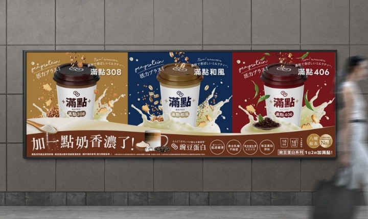
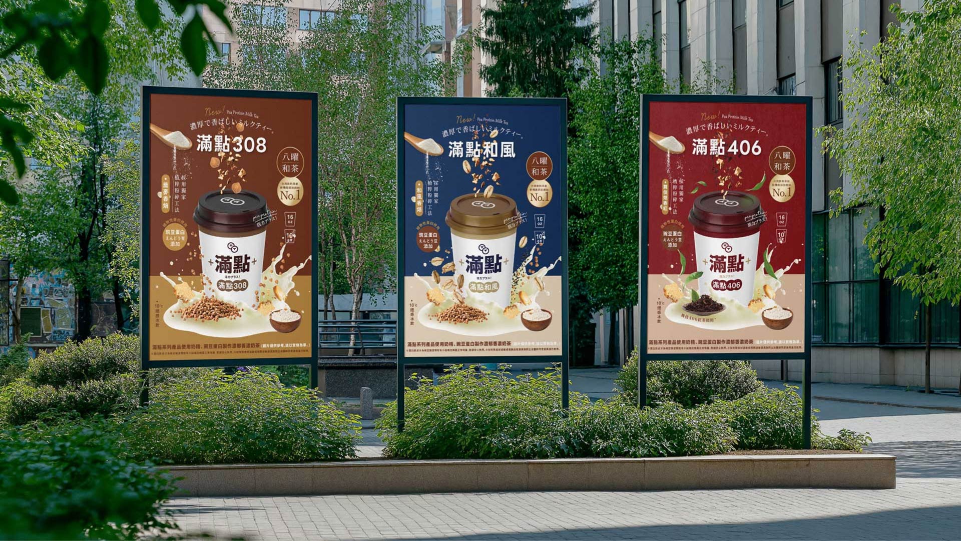
獨特配方,為日常補滿能量
在設計「滿點系列」的廣告視覺時,首要目標是突顯產品獨特的配方與添加的豌豆蛋白,並傳達日常輕鬆飲用的價值感。這款飲品不僅滿足口感上的飽足與風味,更透過植物性蛋白質的補充,強調日常生活中所需的健康平衡。視覺設計上以簡潔現代的構圖,讓產品呈現出「方便補充,隨時滿點」的形象,吸引忙碌但講究品質的都市族群,成為通勤、辦公、休憩之間的活力首選。
When designing the visual concept for the “Peaprotein”, the primary goal is to highlight its unique formula and the addition of pea protein, while communicating its easy, everyday appeal. This drink not only satisfies your craving for flavor and fullness, but also supports a healthy daily balance through plant-based protein. The visual design embraces a clean and modern layout, positioning the product as a convenient way to recharge — anytime, anywhere. Perfectly crafted for quality-conscious urbanites, it’s the go-to choice for staying energized between commutes, work, and breaks.


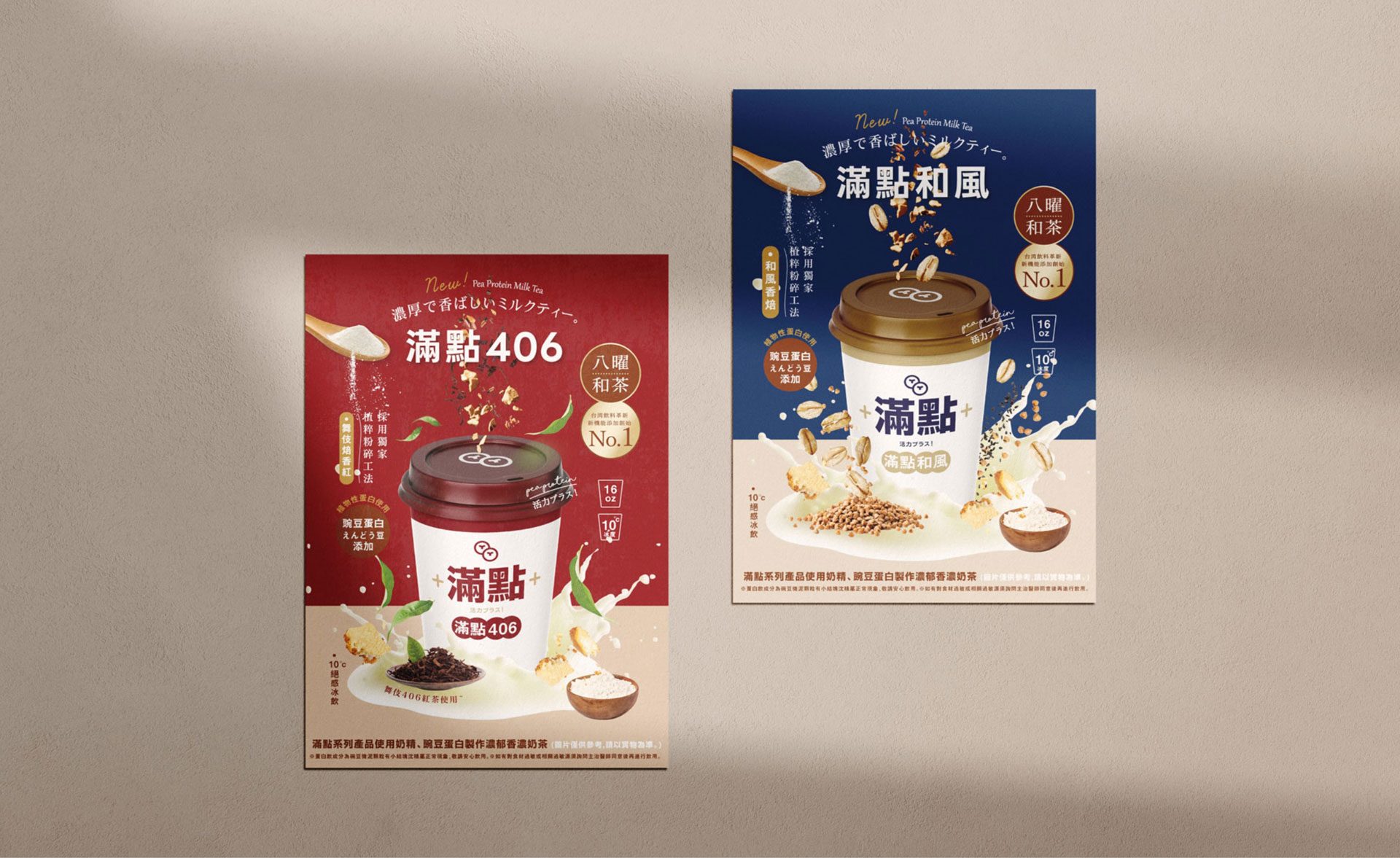
動態視覺,體力加滿點!
畫面以通勤族手持飲料杯的情境為主軸,傳遞「補充精神活力」的概念;同時運用飛濺、跳躍等動態特效,強化飲品所帶來的滿滿元氣,讓觀者感受到「體力加滿點」的直覺聯想。背景以大量穀物與粉末填滿畫面,營造出既有趣又富含能量的氛圍,貼切呼應產品名稱。文字設計則選用簡潔現代的字體,搭配清晰易讀的說明,標示出產品特色與推薦飲用時機;再透過創意標語,完整呈現品牌的價值主張與產品的機能性。
The visual concept centers around commuters holding the drink cup, delivering the idea of “recharging your mental and physical energy.” Dynamic effects like splashes and jumps are used to emphasize the vibrant boost the drink offers, creating a direct visual connection to the idea of “fully powered up.” The background is filled with grains and powder textures, building an atmosphere that feels both playful and energetic — perfectly echoing the product’s name. For the text, a clean and modern typeface is paired with clear, easy-to-read descriptions that highlight the product’s features and recommended consumption moments. Creative taglines further convey the brand’s core values and the functional benefits of the drink.


獨特配方,為日常補滿能量
在設計「滿點系列」的廣告視覺時,首要目標是突顯產品獨特的配方與添加的豌豆蛋白,並傳達日常輕鬆飲用的價值感。這款飲品不僅滿足口感上的飽足與風味,更透過植物性蛋白質的補充,強調日常生活中所需的健康平衡。視覺設計上以簡潔現代的構圖,讓產品呈現出「方便補充,隨時滿點」的形象,吸引忙碌但講究品質的都市族群,成為通勤、辦公、休憩之間的活力首選。
When designing the visual concept for the “Peaprotein”, the primary goal is to highlight its unique formula and the addition of pea protein, while communicating its easy, everyday appeal. This drink not only satisfies your craving for flavor and fullness, but also supports a healthy daily balance through plant-based protein. The visual design embraces a clean and modern layout, positioning the product as a convenient way to recharge — anytime, anywhere. Perfectly crafted for quality-conscious urbanites, it’s the go-to choice for staying energized between commutes, work, and breaks.


動態視覺,體力加滿點!
畫面以通勤族手持飲料杯的情境為主軸,傳遞「補充精神活力」的概念;同時運用飛濺、跳躍等動態特效,強化飲品所帶來的滿滿元氣,讓觀者感受到「體力加滿點」的直覺聯想。背景以大量穀物與粉末填滿畫面,營造出既有趣又富含能量的氛圍,貼切呼應產品名稱。文字設計則選用簡潔現代的字體,搭配清晰易讀的說明,標示出產品特色與推薦飲用時機;再透過創意標語,完整呈現品牌的價值主張與產品的機能性。
The visual concept centers around commuters holding the drink cup, delivering the idea of “recharging your mental and physical energy.” Dynamic effects like splashes and jumps are used to emphasize the vibrant boost the drink offers, creating a direct visual connection to the idea of “fully powered up.” The background is filled with grains and powder textures, building an atmosphere that feels both playful and energetic — perfectly echoing the product’s name. For the text, a clean and modern typeface is paired with clear, easy-to-read descriptions that highlight the product’s features and recommended consumption moments. Creative taglines further convey the brand’s core values and the functional benefits of the drink.