Taiwan regional association of frozen vegetable & fruit manufacturers
視覺設計 VISUAL DESIGN


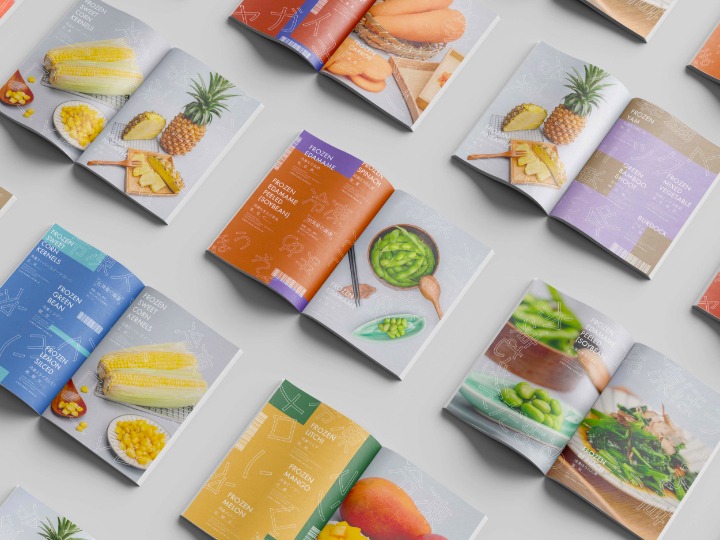
把市場的熱鬧打包,讓冷凍蔬果也保有現採鮮味
為了讓日本消費者在第一眼就能感受到台灣特有的生活風景與食品文化,我們以本地水果市場的熱鬧氛圍作為設計靈感,將標籤貼、叫賣聲、傳統塑膠提袋等熟悉元素,轉化為視覺語言融入包裝設計中。這不僅讓人聯想到新鮮現採的即時感,也傳遞出台灣冷凍蔬果背後樸實、親切、熱情的生活故事,彷彿走進台灣巷弄間的水果攤,一秒感受盛夏的果香與喧鬧。
To ensure that Japanese consumers can instantly experience the unique lifestyle and food culture of Taiwan, we drew inspiration from the lively atmosphere of local fruit markets for our design. Elements such as price tags, vendor calls, and traditional plastic bags — all familiar sights in Taiwanese markets — have been transformed into visual motifs and integrated into the packaging. This not only evokes the freshness of just-harvested produce but also conveys the honest, friendly, and vibrant stories behind Taiwan’s frozen fruits and vegetables. It’s as if you’ve stepped into a bustling fruit stall tucked away in a Taiwanese alley, where the scent of summer fruits and the cheerful noise of the market greet you in an instant.


從色彩到味蕾,冷凍蔬果也能嚐出台灣的鮮活
色彩方面,我們選用了充滿夏日感的明亮繽紛色系,搭配重複排列的文字與圖像,模擬出市場攤位上琳瑯滿目的視覺感受,呼應產品的新鮮度與多樣性。除了吸引目光,這樣的設計也讓消費者在購買時,能夠輕鬆聯想到台灣四季豐饒的水果產地與純粹風味,並進一步建立起對台灣冷凍蔬果的信任與期待。
In terms of color, we chose a palette of bright and vibrant hues inspired by the essence of summer. Paired with repeated text and graphic elements, the design mimics the abundant and bustling visual experience of a traditional market stall, echoing the freshness and variety of the products. Beyond simply catching the eye, this approach allows consumers to effortlessly associate the packaging with Taiwan’s rich, seasonal fruit harvests and their pure, natural flavors — building both trust and anticipation for the quality of Taiwan’s frozen fruits and vegetables.